Mobile shopping has changed the nature of online shopping, with eCommerce statistics showing consistent growth in the mobile market worldwide. As a business owner, your eCommerce website must give customers the type of mobile shopping experience they’re looking for. The mobile-friendliness of your website affects everything from bounce rate to conversions to cart abandonment.

Here are four proven tips for building a website that’s not just mobile-friendly but easy to use on any device. Increase conversions and customer retention by providing mobile shoppers with an experience they’ll love.
1. Use Responsive Design
Responsive design is a method of mobile-friendly web design that adapts to different devices by changing its layout to fit their screens. This is in contrast to building a separate mobile theme that loads upon detection of a mobile visitor. Responsive websites can handle various screen sizes without losing their design integrity. This also translates to better brand consistency across devices. Responsive websites are easier to manage since only one theme design is needed, rather than maintaining both a desktop and mobile theme.
For several reasons, Google has helped define responsive web design as the current standard and favors responsive sites. This preference means Google interprets responsive design as a signal that a website is more beneficial. So, going responsive can earn your site an SEO boost and a happier mobile audience.
2. Consider the Mobile User Experience
User experience is critical on both mobile and desktop. Improving it requires a multi-part strategy that covers every part of your website. Optimizing your checkout is an important step. However, you’ll see a further increase in mobile conversions if you extend your efforts to your whole website.
Browsing the internet on a smartphone or tablet has a different feel than browsing on a desktop. You must be mindful of how your design decisions might affect mobile users. Online shopping is inherently more complicated and requires more consideration.
Mobile visitors want their experience to be as streamlined as possible. Some actions that are simple on a desktop can be annoying on mobile. You want to avoid causing frustration that could cause users to leave your website. Every ounce of effort your visitors need to put into your site on a desktop is at least doubled on mobile. For example, a dropdown menu that can be opened by simply hovering the mouse over it on a desktop will require at least one tap per menu level on a mobile device.
Make things easy for mobile shoppers by organizing your website to require the fewest possible taps to navigate to the products they’re looking for. Some mobile websites use the first tap on a link to substitute for a mouse hover, with the second tap representing the actual click, but avoid this. Requiring mobile visitors to tap a second time increases friction and can cause customers to assume your site isn’t working correctly.
If possible, a customer should be able to get to their desired product within three clicks or taps. Structure your pages and product categories with this goal in mind. This can reduce the number of pages the visitor will need to load. This is a massive help to mobile shoppers with a slow connection or limited data.
3. Minimize the Customer’s Need to Enter Information
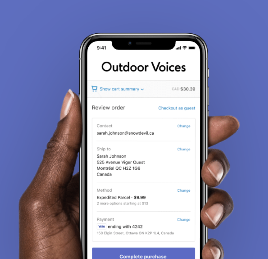
Typing in a credit card number can be annoying enough on a desktop, and it’s even worse on a smartphone. Remember, too that smartphone visitors could be shopping from anywhere — public places, mass transit, while walking the dog — and may be reluctant or unable to take out their credit card at the time. Forcing them to enter their card number will cost you sales.
Solve this problem by accepting alternate payment methods that don’t require the customer to enter information other than a PIN or password. Digital wallets like PayPal, Apple Pay, and Visa Checkout allow customers to check out quickly using previously-saved payment and shipping information.
Digital wallets can also help your eCommerce store appeal to more customers by associating you with a popular brand. For example, Amazon Pay lets customers check out using their saved information from their Amazon account. By adding it to your payment options, you’ve made your store instantly more attractive to millions of Amazon customers.
4. Support Cross-Device Shopping
Sometimes a customer will start shopping on one device and want to finish their purchase on another. There could be any number of reasons for this… Maybe their phone’s battery was running low, or maybe they just wanted to fill their cart and intended to go through checkout later at home. Regardless of why they might do it, customers will appreciate it if your online store makes this possible. You can help customers in this situation by allowing them to save their cart for later access.

On the simplest level, saved carts let your online store support cross-device shopping. You can also expand the feature to make it even more convenient. Instead of causing saved carts to be automatically deleted when the customer goes through checkout, give customers the option to retain the cart in case they want to repeat the same purchase later. All customers appreciate not having to find their favorite items again, especially on mobile where every convenience is crucial.
The ability to save carts also encourages customers to make an account on your website to take advantage of this feature.
Conclusion
Mobile shoppers have different demands than those on desktops. If your eCommerce site doesn’t meet their needs, they will likely abandon your store and shop elsewhere. By following the above tips, you’ll provide the type of experience mobile customers are looking for. Many brands are behind on mobile optimization, so your site will stand out further.